Corona Investing
I promised that I’d include all forms of measured thought when creating this Modicum Challenge. Well, the inner Armchair Economist in me has been leaning far over the edge into behavioral economics that the more practical side of the discipline has been severely short changed thus far. So I thought I’d spend a bit of time capturing my thinking on how to invest in light of the coronavirus.
Caveats
Now a few caveats of course:
- Of course, this is not investment advice, nor am I an investment advisor. And my skills in this area are entirely questionable and not to be trusted any more than a monkey. Assessing the intelligence in pursuing these investments are left as an exercise to the reader.
- These are grossly simplified models, from a layperson. Horrible stuff with plenty of flaws.
- Profiting from a global pandemic is unpalatable to most, and I am keenly sensitive to any suggestion of profiteering. In this Modicum, I’m simply exploring where financial investment opportunities exist beyond the realm of ethical judgement. Assessing the ethics of pursuing these investments are also left as an exercise to the reader.
- Lastly, the market is a highly efficient marketplace, and one in which I supremely trust index algorithms to keep humming during normal times. But I do believe that during sudden spikes of unanticipated blows to the economy, most automated algorithms start to fray, not being able to understand the underlying motivations of the blow. In this instance, the individual may have a chance to outperform the monkey, and perhaps even the index fund.
Infection Curves
OK, first let’s get some basics – namely, how bad is this infection going to be? Of course we do not know, but here are some guesses. First, this is a dated graph from the Economist from the middle of February:
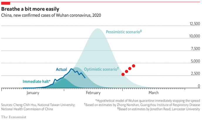
Of course, we are seeing that the caption was a bit optimistic. The red dots are my additions showing the rise in new cases globally for the past week.
Here is the current infection totals, as of today (source: JHU):
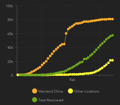
As you can see, global infections are on the rise (yellow) – as we all know. These (as all graphs in this modicum) are linear scales.
So ultimately knowing the financial impact of the virus is foremost a matter of predicting where we will go from here in terms of infections. There are three options:
- Naysayer Model: “This coronavirus thing is all a hoax and we will see the last of the corona virus by April.” Ok, so maybe you are not quite that bad, but still believe that draconian measures will more than easily prevent the spread of what is otherwise a virus slightly worse than the flu. That’s defensible, but honestly, I am not addressing this model except as an extremely flattened infection graph. This Modicum will need your own augmentations to sort out a strategy. Frankly I just did not consider this as a viable model given what we know today – but make no claims that I could be drastically mistaken.
- Unabated Model: Here, the virus spreads quickly and rapidly and there is little to be done or being done to contain it.
- Lockdown Model: Here, global modern society does everything we can to minimize transmission, effectively flattening the spread of the virus over a longer period of time.
These three models are thus reflected in this graph:
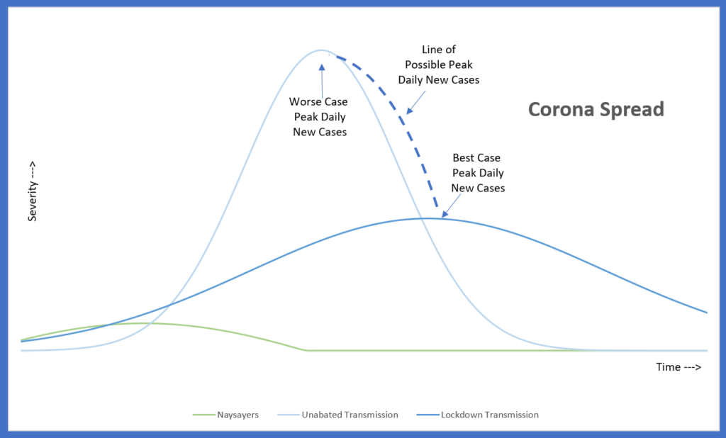
In reality, the peak day will be somewhere on the curve/line connecting the worst case and best case scenarios. We don’t quite know when the peak day will occur because it is more than just R0 – it also takes into account the level of lockdown and other environmental issues (e.g. possibility of weather).
Clearly, for the load on public health facilities, and thus also for any of us wishing to increasing survival rates, the further flattened of an infection curve we can get, the better for us all.
Regardless, though, we now have a line for the peak day.
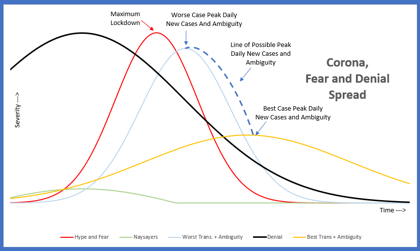
Hype and Fear
If the market was just based on the virus itself, this would be a good start. The problem is, the market is not rational. And for that matter, neither is the typical person’s response to a pandemic. And as such, the irrationality is also a factor to be incorporated in the investment.
Let’s first take into account exacerbating influences – and for that, let’s focus on hype and fear which we will plot in red.
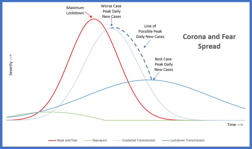
Which leads to a few observations:
- Irrationality usually precedes the peak, and usually is overstated from the peak. Modern journalism and information flow only exacerbates this both in x and y dimensions.
- Both Normalization to fear and anticipation of fear does occur, and as such it is likely that the peak of fear will precede the peak of the item being feared.
- The more irrational people are, the more likely that the Unabated Model is pushed into the Lockdown Model, as people overreact. This is a feedback loop, as the fear will also lesson as the model fails to materialize – but for simplicity sake I am just assuming the maximum fear point here as the primary value is in its relative timing.
- The peak of hype is plausibly measured by the maximum point at which the market area is being closed down for isolation (schools closed, events cancelled, businesses in lockdown).
Denial
Lastly, the human bias to deny death’s possibility is equally well documented (Heidegger allusions aside). Thus we also need to include a plot line for denial. The problem is … this is very tricky. Denial is influenced negatively by the hype curve (the confirmation bias causes denying people to maintain their denial in face of the hype) and positively by the transmission curve (the more it becomes real, the more denial must bow to the pressure of reality).
Here is the Denial influence in black:
Variability is also introduced, for as the outbreak is flattened, so too is the denial curve extended (“See? it’s not so bad”).
Ambiguity
Our graph is starting to get crowded, but we have a few more things still to go. Markets hate ambiguity – anybody who once owned XIV knows that pricing ambiguity is an active part of the market. So let’s see how ambiguity evolves.
At first ambiguity is low until enough cases take off. Then ambiguity shoots through the roof until a clear peak in new cases begins to manifest itself.
If you were to chart this, you would see it largely models the actual infection rate, both in the curve and in time. I already added it to the labels in the chart above.
Economic Impact
Thus far, everything has been focused on investor sentiment. Lets now finally add the actual economic impact. This is pretty tough, because we can not add in impact that is due to sentiment, but rather focus only on the actual business bottom line changes caused by the virus and its first order impact.
For instance, right now, the market is down 10% in the past three weeks. Very few companies, however, have reported any true economic impact. Thus the 10% drop is purely in anticipation and on investor sentiment. This influence attempts to measure only true economic impact to the bottom line of the P&L and not the change in share price. See the green line:
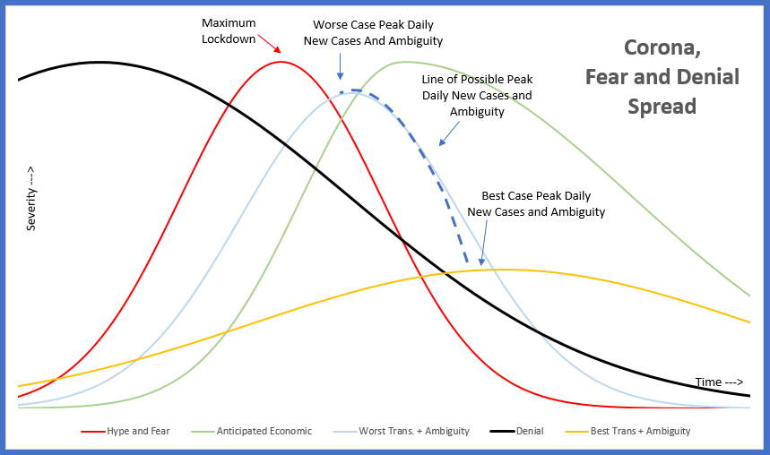
Economic Impact
For economic impact, I assumed that it was initially impacted by the growing number of lockdowns, either direct (campus shutdowns) or indirect (school shutdowns). The successive ripples into supply chains then will fall quickly, followed in turn by demand side fall off. As with all economic models, its a log slough to get out of the hole after the momentum has shifted.
Technically the market anticipates the economic impact, and thus I did pull it in slightly.
Finally, The Market
Alright, now we have enough to make market predictions (in the strict bubble of the variables presented). Here is my calc:
Market = (1-Denial) + Hype/Fear + Economic + Ambiguity
I assumed each influence is equally weighted – I’d love to hear reasons to be otherwise, but I honestly came to the conclusion that they were roughly equal.
Finally, I inverted the stat to model the actual chart of a stock market. Here is what I got (and yes, I added a “Now” column to reflect what I believe is the current position on the timeline). There are two lines – yellow and pink, one based on a flatten infection rate, one based on a more rapid infection rate.
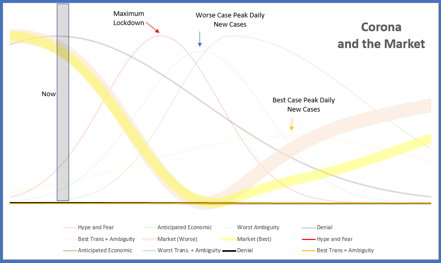
OK, pretty obvious stuff, but let’s look at some subtleties:
- We are just at the early stage of market decline. Why? Hype and Fear will only increase as lockdowns occur nationwide / worldwide. Investors in denial will accelerate impact as trends continue southward. Ambiguity of just how bad it is will continue as long as new cases continue to increase.
- When will we reach rock bottom? It is a bit obvious, but this line of thinking suggests that stocks bottom out right when the worse case peak scenario is hit. Switching to a flattened infection rate doesn’t change this. But note that the influence to push the market low to be earlier or later in time are balanced with the knobs and levers laid out above.
- Exercising Lockdowns will slow recovery. This is a bit counter intuitive, as it is contrary to what is best for society from a health perspective. But the argument is that the quicker we can get over the hump, the quicker ambiguity of the future is full resolved, and thus the quicker we recover. Yes, a flattened infection rate will be more predictable, but that is already incorporated – it just still keeps out there the uncertainty of a flair up (e.g. after lockdowns have passed). We already see this with the Wuhan example.
Practical Decisions
So here are my practical conclusions. Again, don’t even think about following these for your own financial well being without coming to your own conclusion.
- Buy an Ultra Short on the US stock market. I chose U.S. because it is earlier in the infection cycle than Europe, and thus a bit more ripe to catch it before it falls.
- Hold that Ultra Short until the day we see the tip of the daily new infections bell curve materialize, and then sell and buy in. Don’t Be Greedy.
- If the infection rate is progressing on the low end on the transmission/R0 range (currently 0.7%-3.4%), try to look at the transmission rate in countries that are poorly handling the response. Data will be worse, but still, see if you can see if the infection rate is much higher. If so, then this implies that the U.S. infection rate is actually being affected by the lockdown and preventative measures. If so, then consider making your own estimate with a 0.7% – 3.4% transmission rate to determine when the peak would be if the virus is in full force. That should be your target sell date.
- These curves are replicated in other markets. Short emerging markets now, as they will be even harder hit given less facilities and social structure in place. Follow the same guidance for reinvestment.
But wait, what about Stocks?
OK, that is all just playing the market and guessing on the S&P 500. Surely individual stocks are worth considering?
Yup, but the trick here I believe is to separate potential stock buys between those impacted by hype and those by fundamentals.
Hype Stocks
Hype stocks are all those helped by the red line in the graphs above. Because that world is the most evident, these stocks are the hot items in the market.
- BUY – Stuck-At-Home stocks – streaming music (SPOT) and movies (NFLX), food delivery (GRUB), remote work access (WORK, CTXS), online gaming (ATVI), social media
- BUY – Anti Real Virus stocks – cleaning supplies (CLX), vaccine companies
- SHORT – Travel stocks – Airlines, Oil & Gas, Hotels
- SHORT – Public Spaces stocks – Starbucks, Restaurants, Cruise Ships, Tickets (LYV), Casinos
- SHORT – Insurance Companies – Allstate
Many thanks to friends and my wife for this brainstormed list – it is the product of several conversations.
The problem with trying to move on the hype is … well, the hype is here. In fact, this article basically covers it well. Many – but not all – of the stocks referenced in the article are already seen large movements outside of the S&P.
The time to buy the hype stocks are as early on the red line as possible (i.e. time is quickly passing). As to whether or not it is too late to hit the timing with sufficient up/downside, that’s for you. Mentally, I have many many red flags when investing where the herd is.
Fundamental Stocks
Instead of following the herd and jumping on the hype stocks, let’s instead look at the stocks that are more directly impacted by the actual infection rate lines. After all, the market is still coming to terms with the reality of a pandemic. Looking further is risky, as it is way down the ambiguity line.
The time to buy fundamental stocks are in the early stages of the blue/ yellow infection rate lines. For those, we appear to be still quite early.
So now we must ask ourselves: what if lockdowns are just common place and we are use to it, and the infection rates are just beginning to slow and turn. What new changes are we seeing in the world at that time that translate to impact on a business’ stock?
- Deaths Directs. It is morbid, but we could be seeing 30,000 to 300,000 to 900,000 more deaths in the next 6 months. That’s directly correlated to the infection lines, not the hype or denial lines. So what to invest in? SCI and HI for instance. Note: SCI was the subject of a great study on Seeking Alpha.
- Death Indirects: If 50,000 to 900,000 people > 50 years old suddenly pass away, what ripples will exist? Lots of extra homes hitting the market? (Title Insurance? Short Family Housing?)
- Prolonged Lock Downs: Companies have been quick to start lockdowns, but we don’t hear much about ending a lock down. If they persist for a long period, then what secondary ripples will begin showing up?
I am still working on these (and would love ideas) – it is admittedly quite sparse.
But for now, that concludes my Modicum for now. In the mean time, stay safe, take Vitamin C and hope for the best.